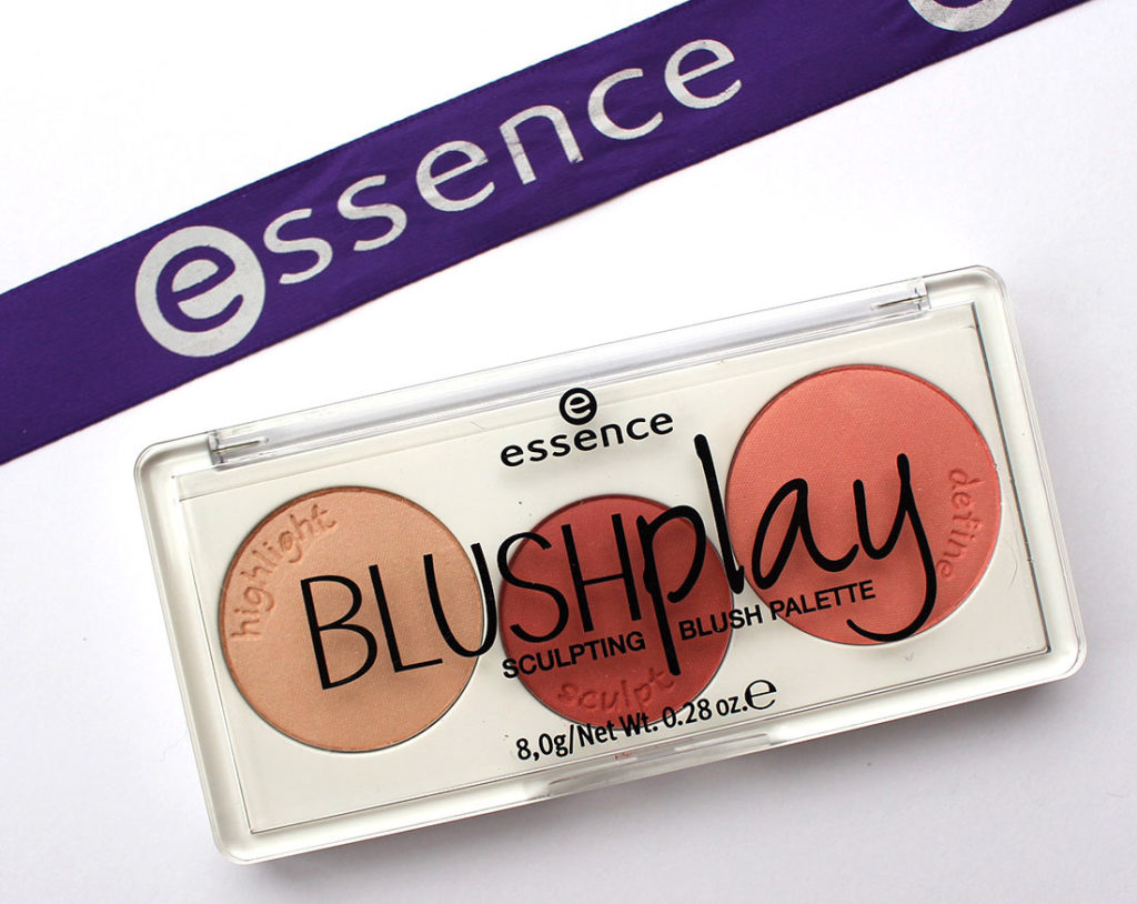
When I filmed my new essence Fall/Winter 2017 products, easily the most requested product for review was the BLUSHplay Sculpting Blush Palette. And I have to say, it intrigued me to – the layout and colour scheme of it is very similar to my beloved Smashbox LA Lights in Culver City Coral.
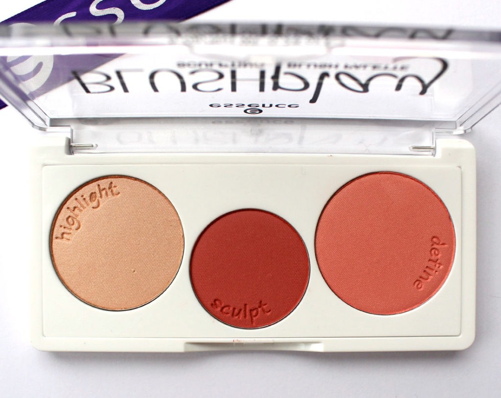
You’ll have to pardon my product shots of these – I thought I had colour corrected them appropriately, but I can see now that they’re coming off very red/orange, which is not the shade they truly are in the pan. This trio set is the “Play It Peach” option (they have a more pink-toned one as well) and the coral tones of it are right up my alley. They’ve structured the palette to have a highlighter, a deeper shade (sculpt) and a paler tone (define). I don’t personally layer my blush in any kind of construction like they’re indicating, but I think it is nice to have two blush shades and a complementary highlighter all in one palette.
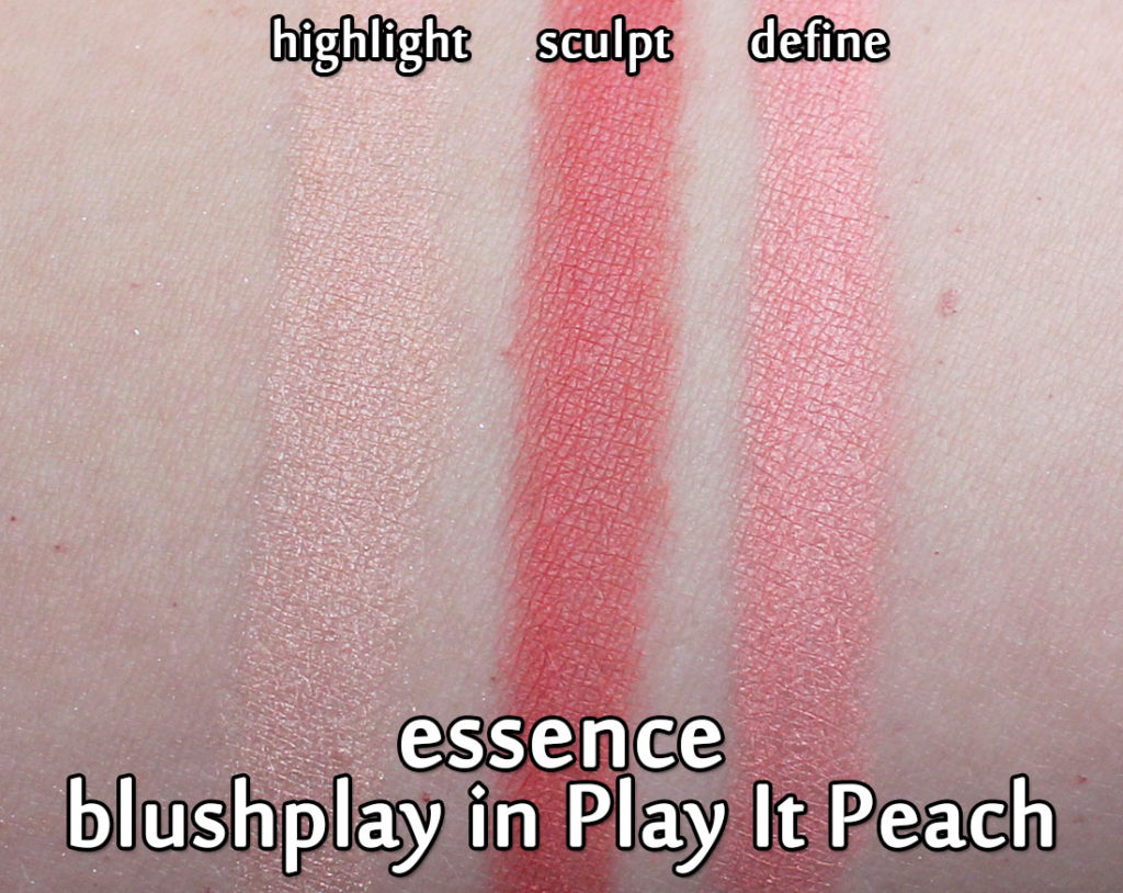
Despite my product shots looking slightly off-colour, the swatch shots above are bang on. This is a perfect representation of the shades, so you can definitely see that this fits more into the coral/peach side of things.
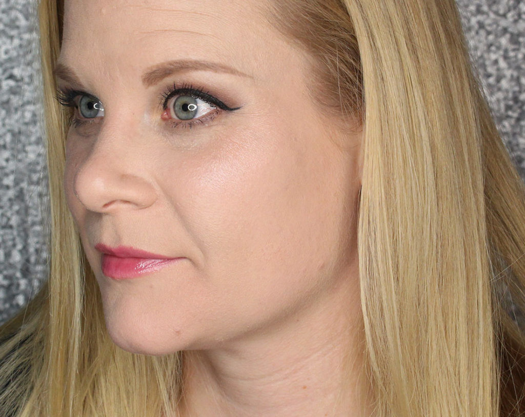
Those looking for a super reflective highlighter may want to look elsewhere, but the BLUSHplay highlighter is still quite stunning. I know we’re so locked into basically creating a lens flare on our faces now, but there is something to be said for a natural sheen. The highlighter in this palette definitely delivers on the more natural side of things.
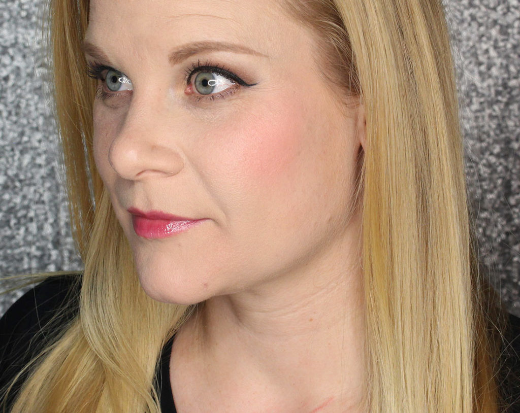
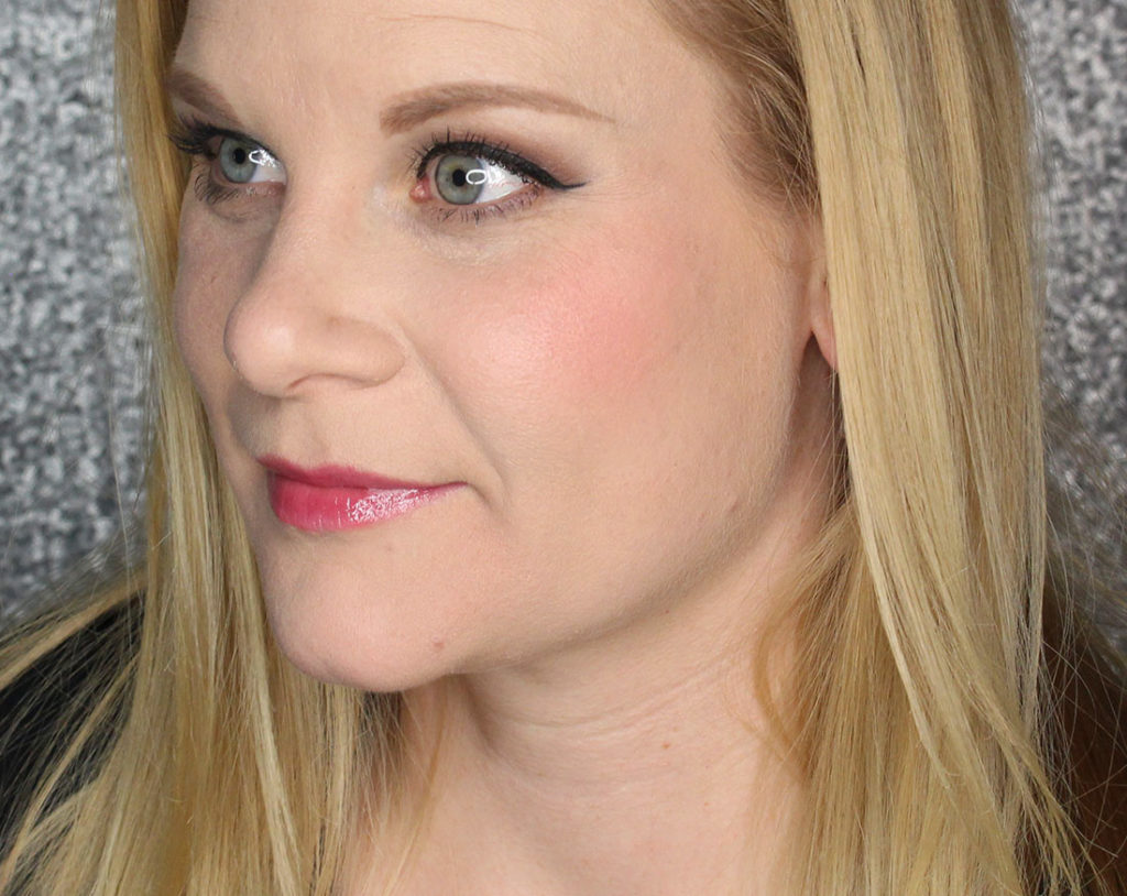
What surprised me the most is that I see no colour difference on my cheeks between define (pictured above) and sculpt (pictured below).
I went over my photos so many times to figure out if I had screwed up labelling them and I’m pretty sure I didn’t. Which is why I’m so surprised that the paler shade looks so dark on me! I can only assume that the pale shade has more pigment that I anticipated, and the darker shade has less. Both shades provide a BEAUTIFUL colour on my cheeks, but I’m really stunned that they basically look identical.
Final Thoughts
Although I’m extremely surprised that the two blush shades ended up looking the same (and honestly, I can’t help but wonder if I screwed up application and applied the same shade twice because I really do not get it), I have to point out that the colour(s) are gorgeous. The highlighter is more subtle, but it does provide a beautiful glow to the skin. I also like that the colour tone is in line with the blushes, so you don’t have to be worried about applying a clashing highlighter to your face. The price tag is super low on this ($6.99 CAD), and honestly the product way outperforms the associated price point. This isn’t a “decent for its price tag” product – this is good DESPITE the price tag!
The essence BLUSHplay Sculpting Palette can be purchased on essencemakeup.ca for $6.99 CAD.
The product featured in this post was sent to me for review.
Interested to see what other shades this product comes in! I like these type of all in one palettes that are still travel friendly!
Just a pink shade is also available, but I don’t have it sadly so I couldn’t do a comparison.